Case study
Botanic Gardens of Sydney
The power of plants
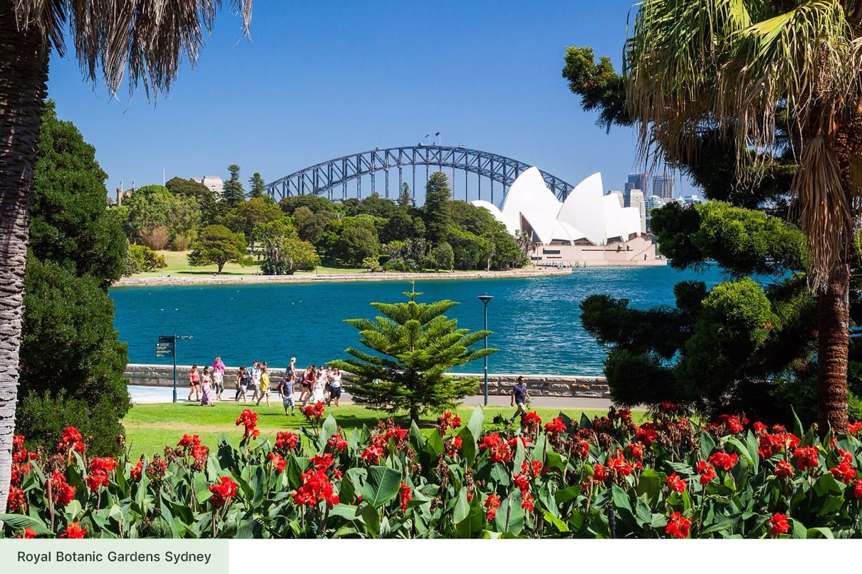
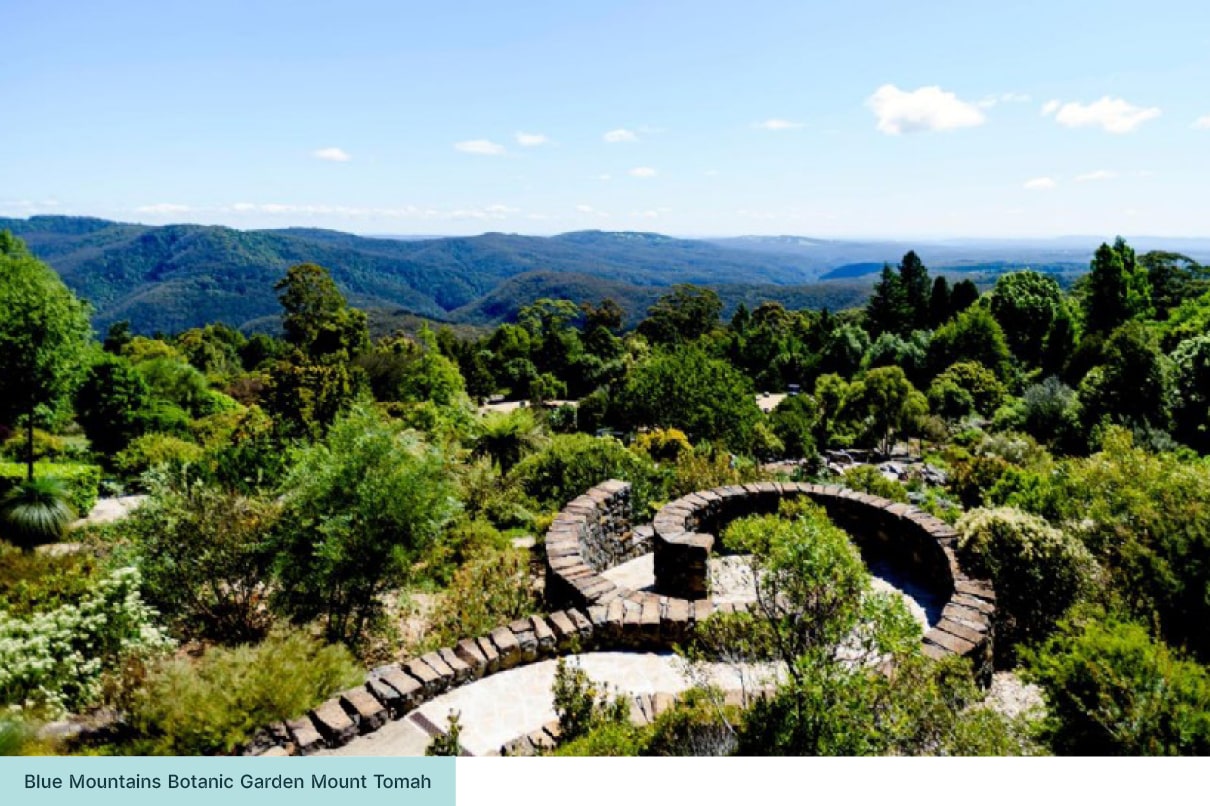
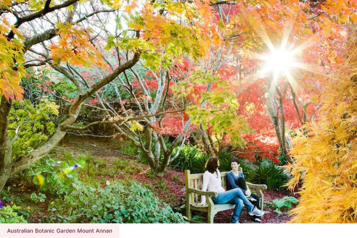
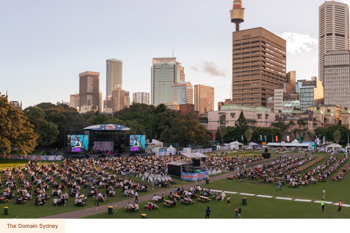
Spanning more than 508 hectares across three gardens and one major public domain, the Botanic Gardens of Sydney is one of Australia’s most significant scientific and cultural institutions. Home to diverse plant collections from across Australia and around the globe, the gardens play a long-standing role in the environmental and historical story of New South Wales.
The task
Welcoming millions of visitors each year and contributing hundreds of millions of dollars to the national economy, the organisation needed a digital presence that reflected the scale, impact and importance of its work.
My responsibilities
Content strategy
User Experience
User Testing
User Interface
Interface detailing
Credits
Work completed whilst at Folk
Awards

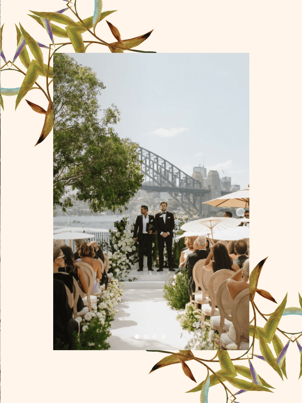
Four icons, one website
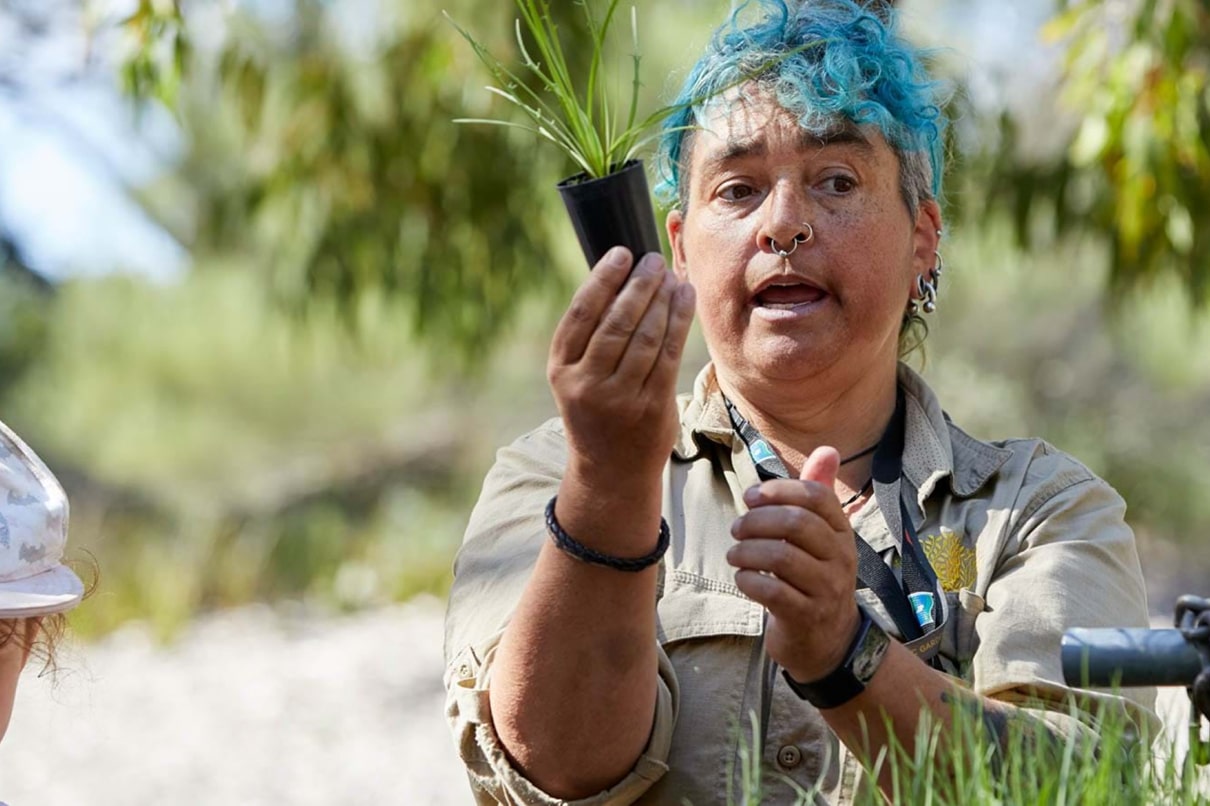
Whilst working at Folk we reimagining the digital experience for the Botanic Gardens of Sydney, bringing multiple garden websites together into a single, unified platform. The focus was on creating a clear, cohesive experience that better represented the scale and diversity of the gardens, while making it easier for people to explore what each location offers.
In close collaboration with the Botanic Gardens of Sydney team, we worked to define and deliver the end-to-end website experience, ensuring it celebrated the role of plants, encouraged visitation, supported learning and discovery, and introduced more efficient, sustainable ways for staff to manage and maintain content.
Four icons, one website
Whilst working at Folk we reimagining the digital experience for the Botanic Gardens of Sydney, bringing multiple garden websites together into a single, unified platform. The focus was on creating a clear, cohesive experience that better represented the scale and diversity of the gardens, while making it easier for people to explore what each location offers.
In close collaboration with the Botanic Gardens of Sydney team, we worked to define and deliver the end-to-end website experience, ensuring it celebrated the role of plants, encouraged visitation, supported learning and discovery, and introduced more efficient, sustainable ways for staff to manage and maintain content.

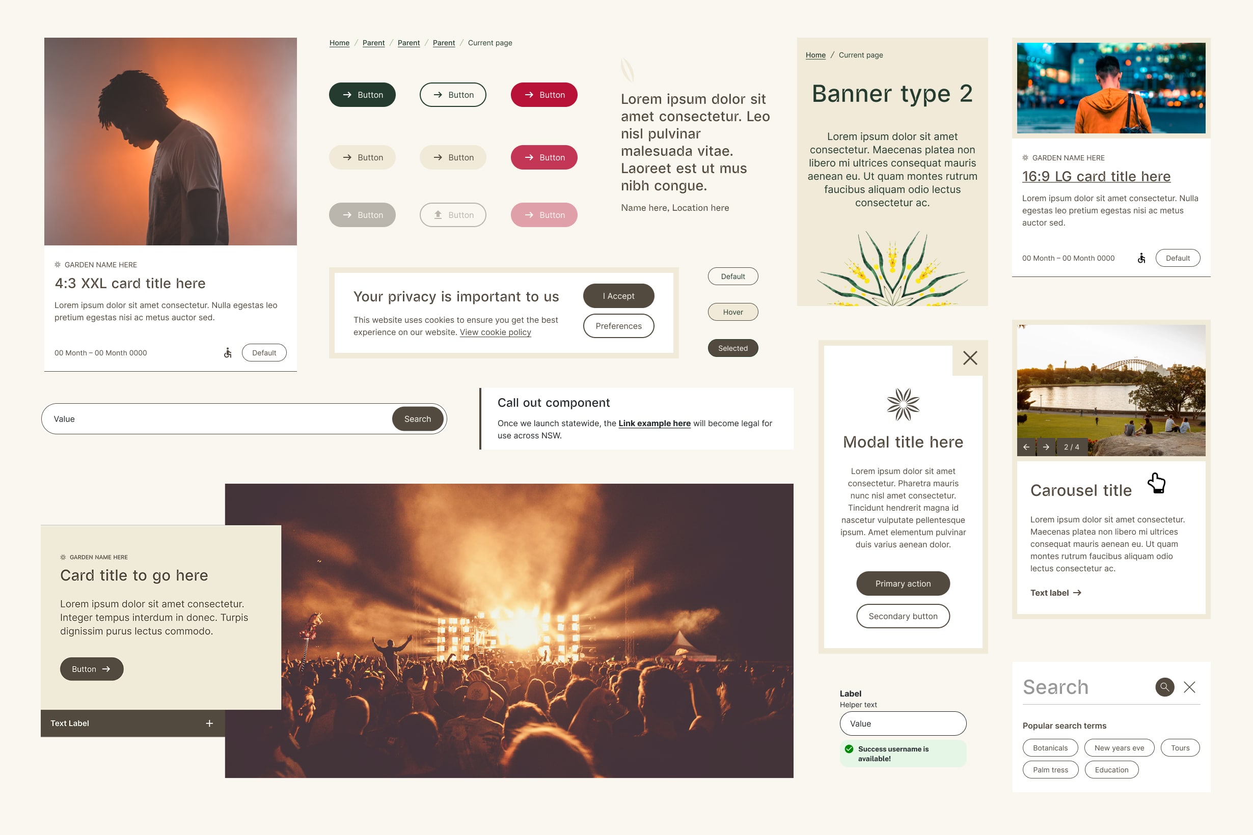
The visual identity
Our job was to bring the Botanic Gardens of Sydney brand to life online, translating its visual language into an engaging digital experience that encourages exploration and connection. Through considered use of typography and graphic treatments, I created a contemporary, expressive interface that reflects the character of the gardens.
An explosion of colour
Using colour as a core design device, drawing from the shifting tones of the gardens as seasons and landscapes change. I designed the system to give content editors flexible colour control, allowing each garden to retain its own character while still feeling part of a unified digital experience.
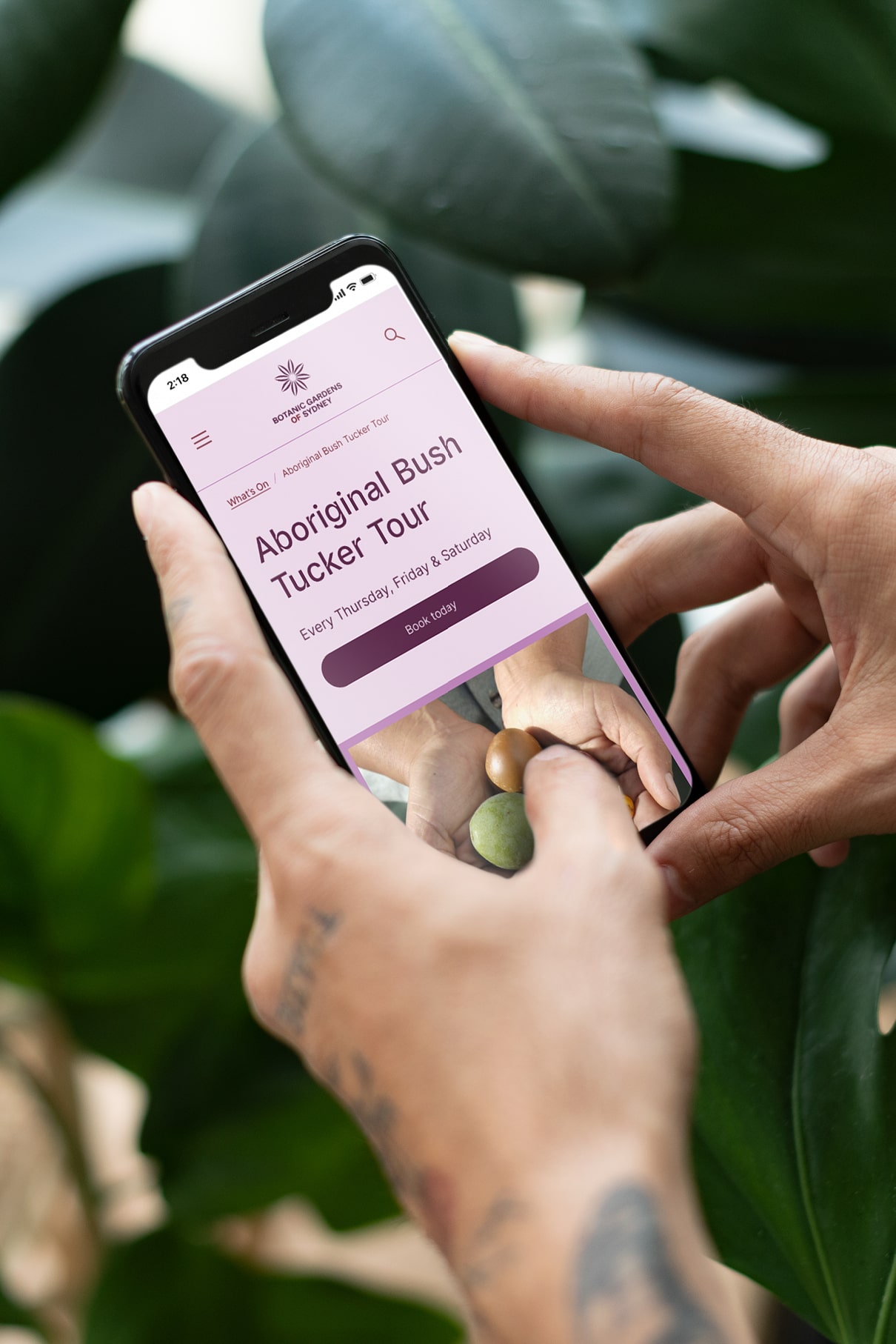
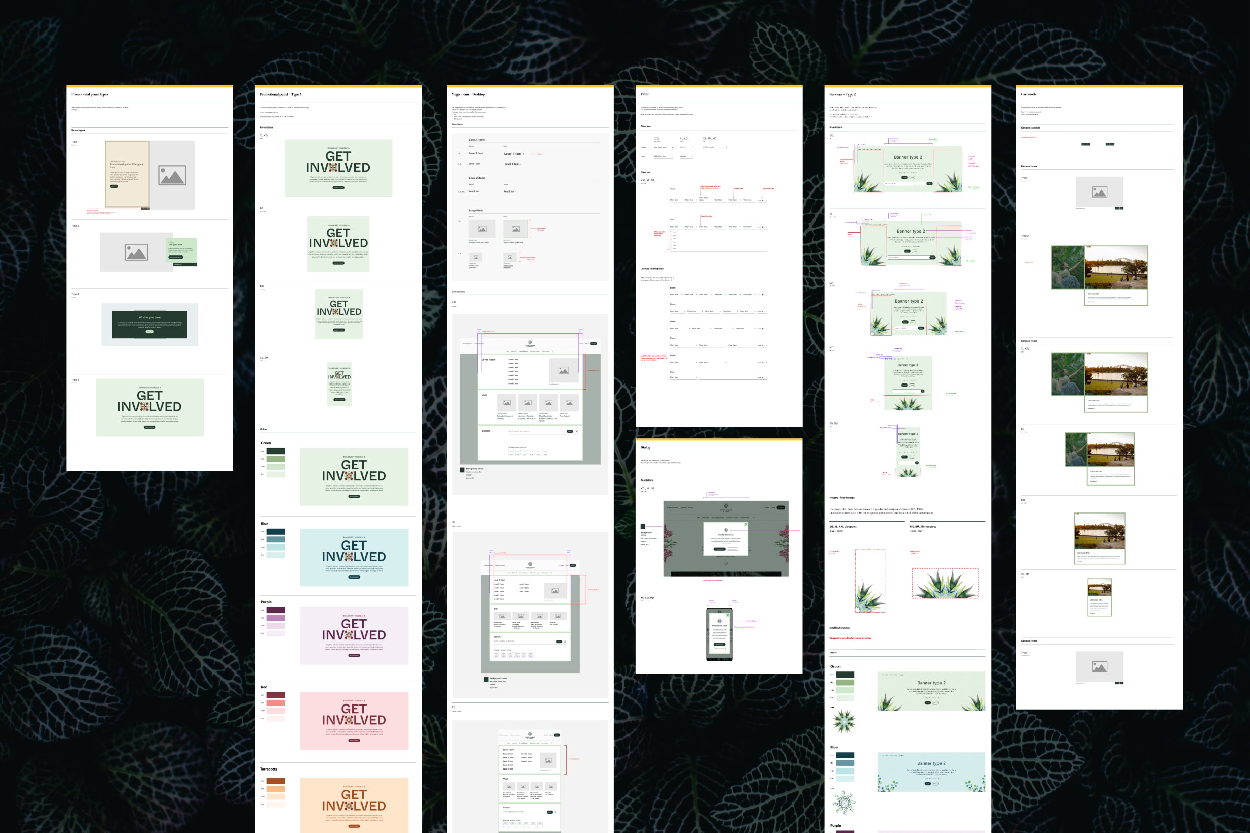
A content strategy as digital fertiliser
With the Folk team, we designed the content strategy to bring multiple garden websites into a single, cohesive experience, reducing duplication and improving navigation. By reorganising content around user needs rather than locations, we created clearer pathways that encourage exploration and learning across all gardens.
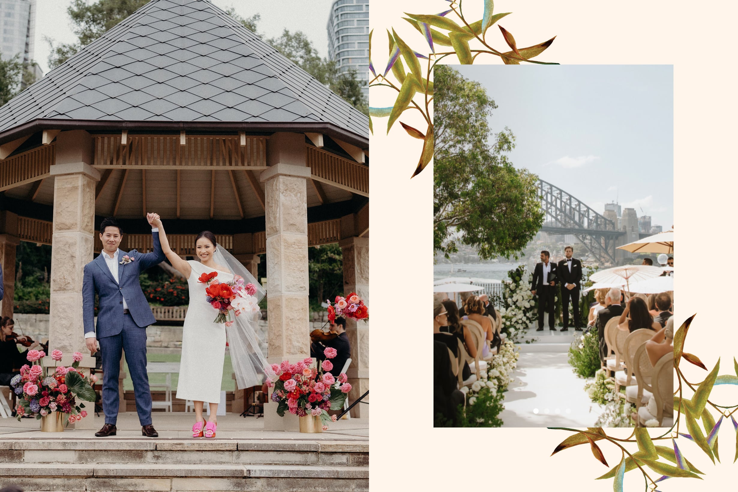
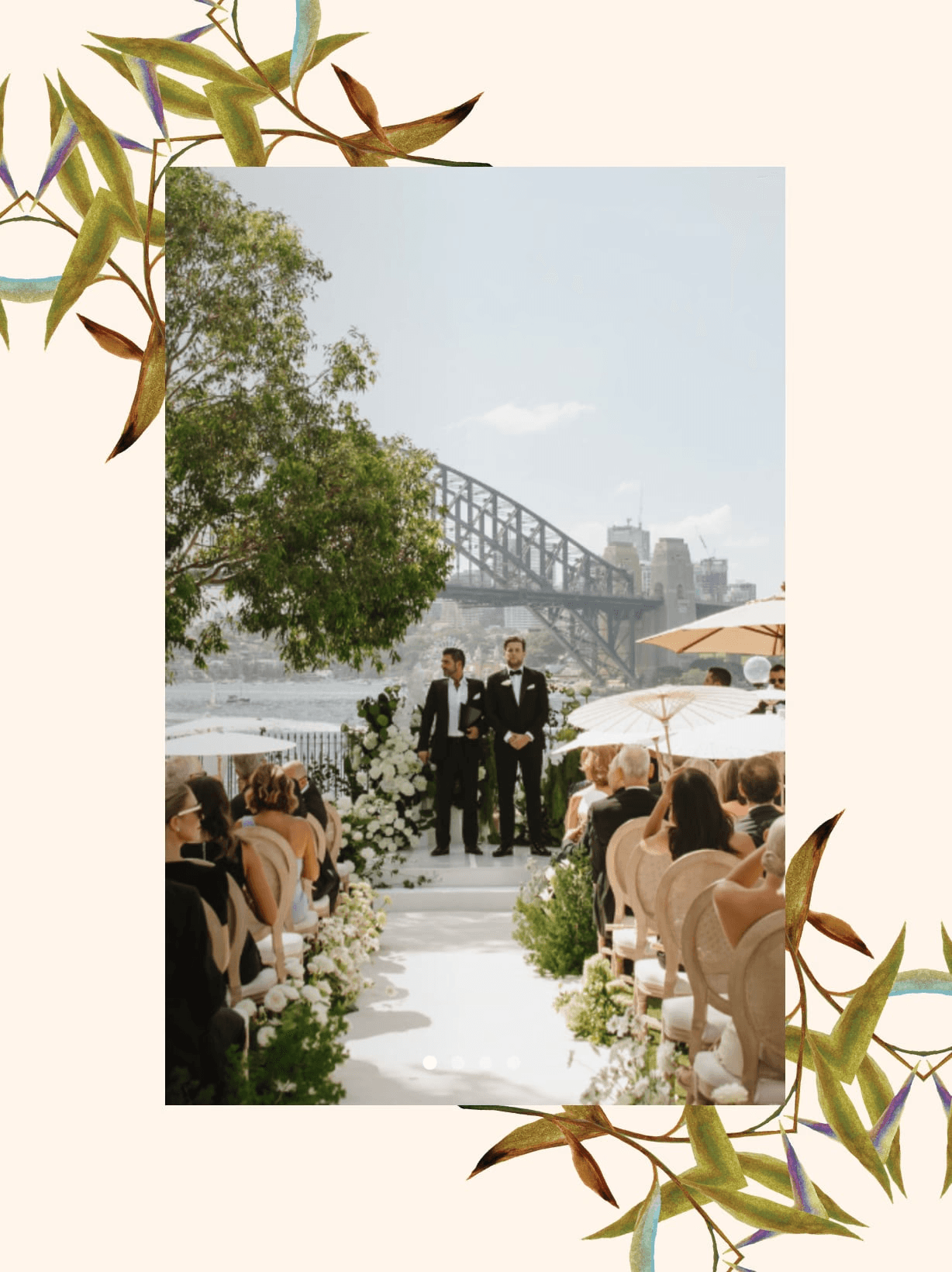
Information architecture
Shared sections such as Venues & Spaces and Discover & Learn house content from all garden locations. This approach invites users to enter the site through pathways aligned to their immediate needs, while exposing them to a richer and more diverse range of content across all gardens.
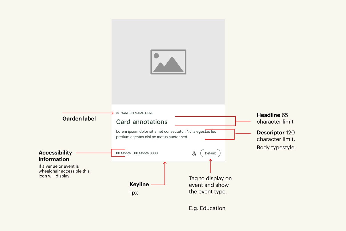
Best-practice design for an inclusive experience
The website needed to express the new visual identity while meeting the highest standards of inclusive design, accessibility, and UI/UX best practice.
The NSW Digital Design System was used as the foundation, providing accessible and inclusive components and patterns. These were then extended and refined to reflect the expressive visual language of the gardens, ensuring the site is both visually engaging and accessible to all users.
& another?
Try one of these.
Or view all projects here.


& another?
Try one of these.
Or view all projects here.